Top 10 Innity Lightbox Ads
(continued)
Here’s part two of our Top 10 Innity Lightbox ads. We hope all of you had as much fun going through the first half as we did putting it all together for you guys. Let’s get right into the Top 5, shall we?
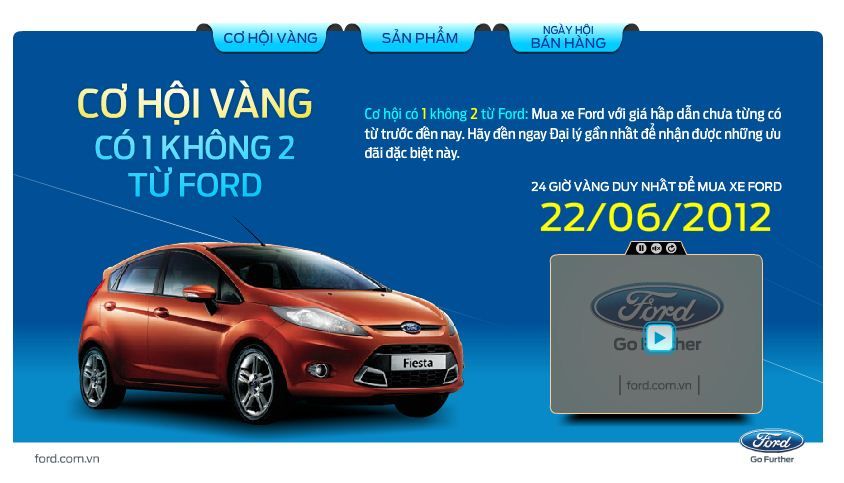
5. Ford (Vietnam)
Campaign objective: Ford targeted to drive awareness and action on their latest car promos in Vietnam.
The Lightbox opened up to present the audience with the ongoing promotion in the form of a video. Multiple informative tabs were included to increase audience interaction time on the ad. Overall a very successful ad unit that received much engagement from the target audience!
4. HTC One S (Indonesia)
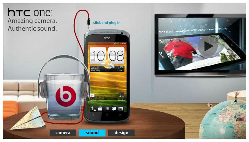
Campaign objective: HTC sought to promote and increase awareness on their latest mobile phone model among their targeted audience.
Users that engaged with the Lightbox could effortlessly learn more about the HTC One S, its amazing camera, audio system, as well as a 360 degree view of the sleek gadget. HTC also incorporated a TVC into the Lightbox ad to increase favourability and consideration among its audience – all without leaving the ad unit.
3. Canon Pixma (Malaysia)
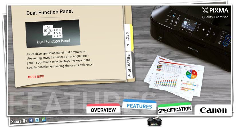
Campaign objective: Canon wanted to drive awareness and purchase intent for their latest Pixma Office Series.
The sleek Lightbox opens up to reveal two TVCs and multiple tabs for increased user interaction. Audience could swiftly digest Canon Pixma’s unique features as well as dive deeper to learn more about the specifications for further consideration.
2. Nokia Asha 200 (Thailand)
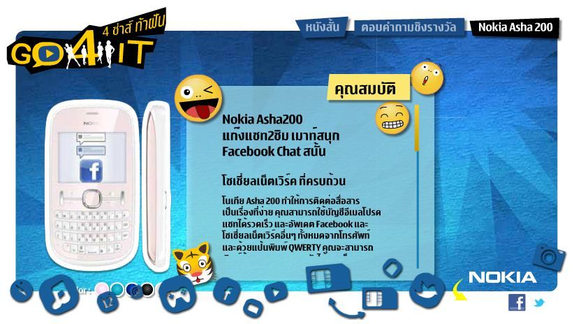
Campaign objective: Nokia aimed to promote the new Nokia Asha among active, on-the-go youths.
As soon as users activate the Lightbox, they will be shown Nokia’s TVC which promoted the use of Nokia Asha among youths. To further add interest and involvement, a mini game was included in the ad unit. Within the LIghtbox, users could also learn more about the mobile phone, its unique features and specifications. Social sharing buttons were also incorporated for easy sharing.
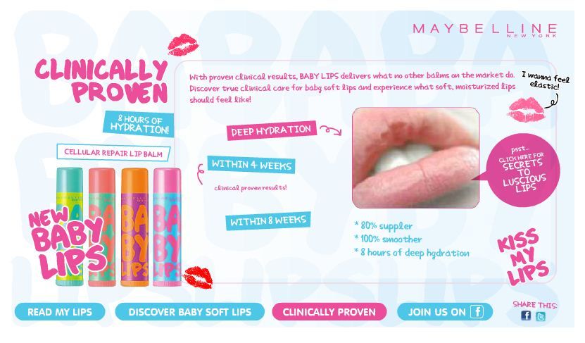
1. Maybelline Lip Balm (Malaysia)
Campaign objective: Maybelline aimed to promote their latest lip balm to their targeted female audience online
The Lightbox was beautifully designed to be all things glossy and sleek with videos and multiple tabs designed to educate the audience on the features as well as provide an abundance of useful tips on lip care. Users could also share the ad to their friends on Facebook and Twitter.
Stay tuned as we reveal even more fabulous ad units we worked on so far, like the Balloon, Slider, Billboard, and more. Contact us if you’d like to learn more about engaging the right audience, we’d be happy to help!
