Presenting Innity’s Top Creatives in February! [2018]
Let’s start with a question here: What kind of ad would you expect to see during valentine’s season?
.
.
Ads that show you where to get a bouquet from; ads that show you valentine’s day promotions; ads that give you dinner date ideas, … (Does any of these come to your mind?) In this fast-changing digital advertising environment today, other than creativity, another equally important aspect we should take into account while creating an ad is ‘RELEVANCY’. In order to grab audience’s attention and arouse their interest to engage with your ad, it’s very important to create an ad that is connected and relevant to your audience and their needs.
For this month, we have Fitbit, Manhattan Fish Market, Canadian International School of Phnom Penh, and Apple Daily to show you how brands can creatively raise awareness on their festive special products with Innity ad formats.
Simply click on the links below to view the demo!
Advertiser: Fitbit
Agency: IPG Mediabrands (S) Pte Ltd
Product: Innity Responsive Over The Page
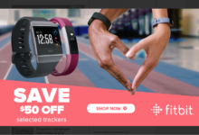
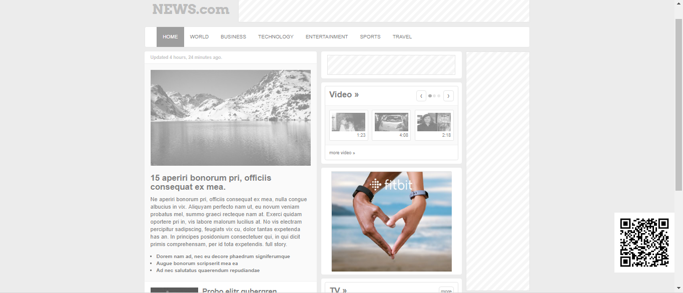
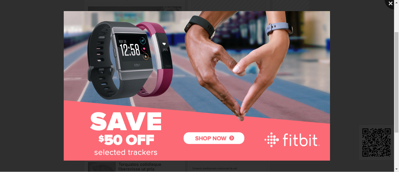
On Valentine’s day, Fitbit launched a campaign that gives out 50% discount on selected trackers. Fitbit has utilised the Responsive Over The Page ad format of Innity to shout out about the 50% off campaign. This ad format is cross-channel compatible where audience were able to view the campaign on both web and mobile display. The ad unit would first expand into a full page layout with some animated content about the 50% off, then turned into a standard display ad once the animation ends. There was a ‘shop now’ button that allowed audience to find out the trackers that were on sale. Though the full page ad length was short but it was clear enough to deliver right message to the audience.
Advertiser: Manhattan Fish Market
Agency: Media Consortium Corporation Sdn Bhd
Product: Innity Site Take Over
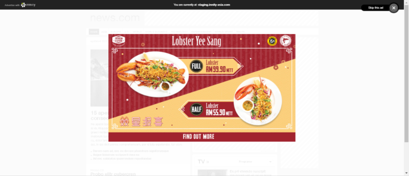
During Chinese New Year season, Manhattan Fish Market ran a campaign to showcase its Chinese New Year special menu using the Site Take Over ad format of Innity. The ad unit was displayed in a full-page overlay format showing audience the items and prices of their special menu with a ‘cross’ button on the top right of the ad unit to skip ad and a ‘find out more’ button right below the menu for audience to enter Manhattan Fish Market’s site. The content on the ad was displayed large and obvious enough on the screen that it could hardly be missed. If you’re planning to make a powerful first impression with your audience, this is the one you should go for.
Advertiser: Canadian International School of Phnom Penh
Product: Innity Mobile Overlay Cards
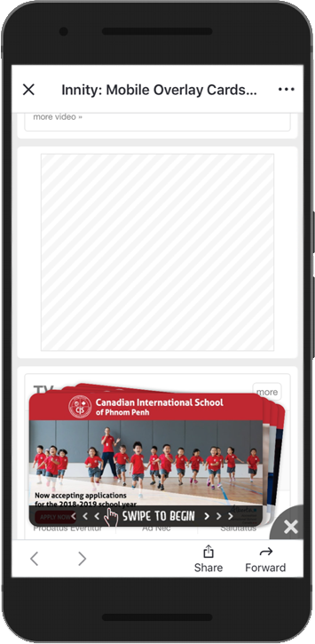
The Canadian International School of Phnom Penh has recently launched an enrollment campaign using Innity’s Mobile Overlay Cards ad format. The ad format encourages interaction between audience and ad by asking audience to swipe the ad unit to find out more about the school enrollment. The ad appears at the bottom of the page with an instruction guiding audience to swipe left or right for more info cards. Until the last info card, audience were guided to find out more about the enrollment.
Advertiser: Apple Daily Taiwan
Product: Innity Mobile Spin
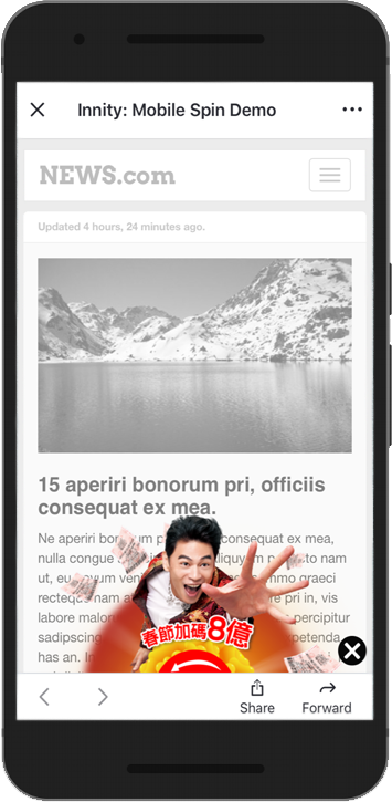
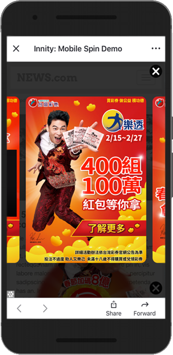
In conjunction with Chinese New Year, Apple Daily in Taiwan launched a promotional campaign to raise awareness for its brand. This ad unit utilised the Mobile Spin ad format of Innity where audience were prompted to spin the image for more content, allowing audience to interact with the ad unit. Besides, the ad unit would enlarge and expand into a half page ad unit with more content regarding the campaign once the audience clicked on any of the images on the spin. On every enlarged ad image, there is a ‘find out more’ button to guide audience to Apple Daily’s site.
Curious to know more about our ad formats? Feel free to contact us!

